
When I looked at my blog stats last week (for the first time since last January), a couple of things stood out. First, of course, is that recreational substance abuse—perhaps combined with advanced illiteracy—is alive and well among my blog visitors. At least, I can’t see any other possible explanation for the continued hits and searches for a combination of “sex”, “taub”, and other truly disturbing search terms, especially given the weekend spikes in same. (How could “unicorn sex c*ck taub” even possibly be a thing, let alone one that leads to my blog?)
But the second thing I noticed was that the most consistently popular blog posts are my completely irrelevant observations about death, kids, pets, life and other random topics. And it turns out that I’ve written a lot of them over the years. So I decided to gather them together for a little Kindle experiment.
But I could use your help. The blog posts (plus some old articles and columns) are written, I have a couple of illustrations that will hopefully sneak in under Kindle’s size limitations, and I’m trying to keep the sale price at rock bottom by self-publishing. That just leaves the covers.
And that’s where you come in. What should a cover for a collection of (hopefully) humorous essays look like? With fingers-crossed, I went to Canva and tried out a few of their standard layouts. I’d love your input and suggestions. Please vote, comment, and/or tell me to go back to the drawing board. [click on any to enlarge]
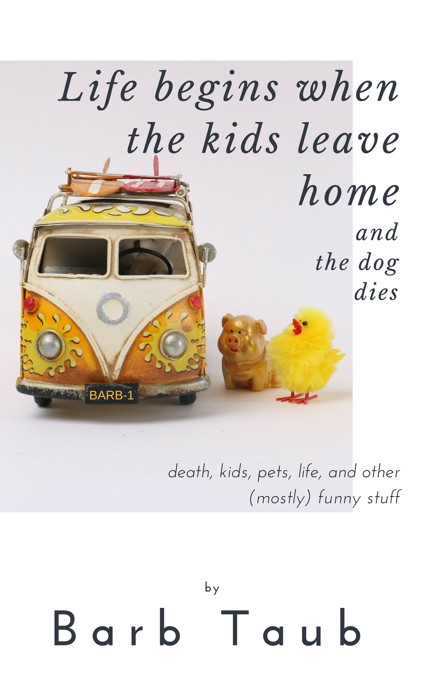
COVER 1
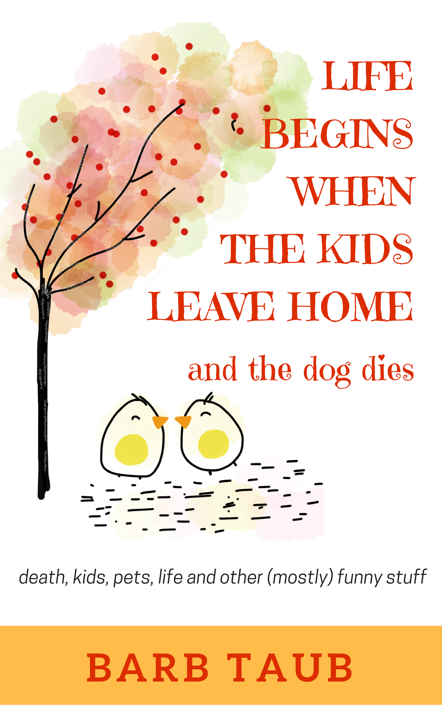
COVER 2
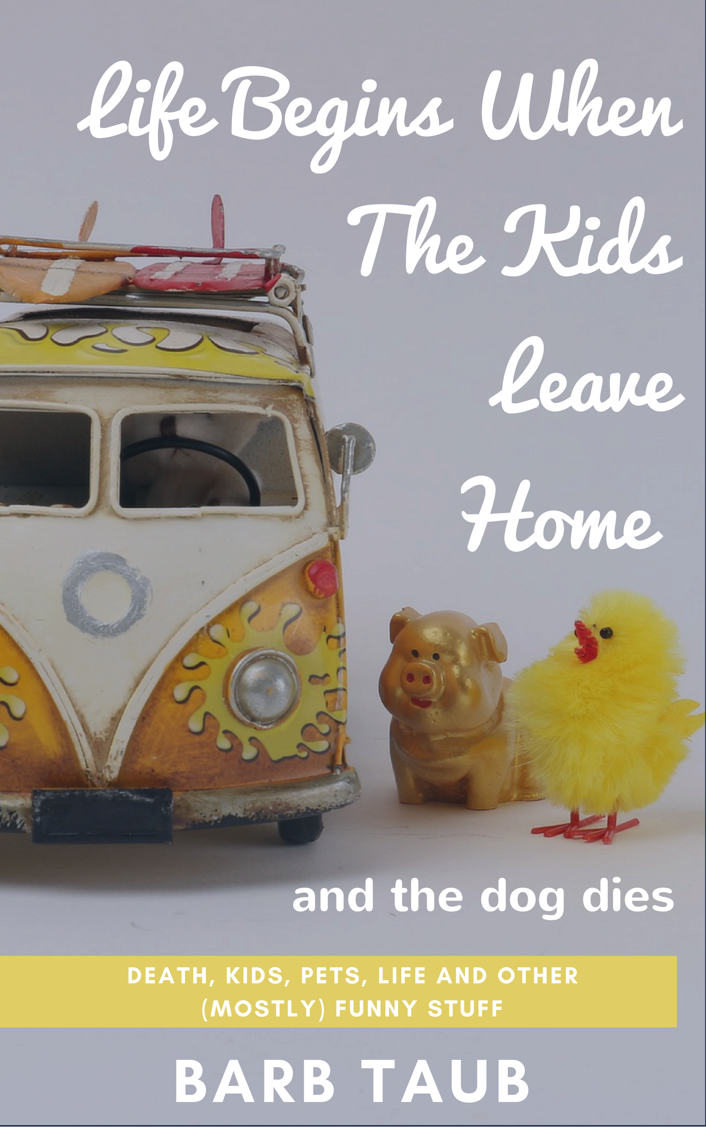
COVER 3
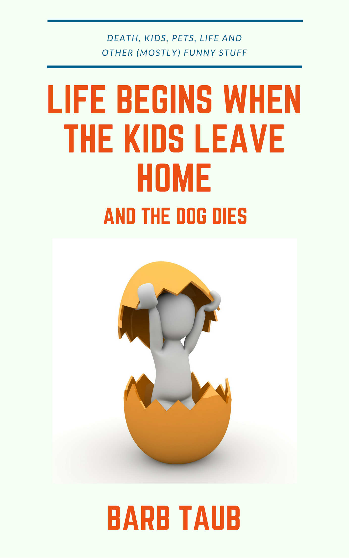
COVER 4
Oh, and if anyone would like an advance copy for review, please let me know.
Just let me know where to send an eARC and my undying gratitude.
Discover more from Barb Taub
Subscribe to get the latest posts sent to your email.

Voted!
LikeLiked by 2 people
Thank you so much
LikeLike
😊
LikeLike
Looks like a tie right now. Big help we are!!
LikeLiked by 2 people
This is an interesting new experience for me. So far, there isn’t any clear winner (which probably speaks more to the fact that I should get back to the drawing board, of course…)
LikeLiked by 1 person
Voted – and of course I will! Are you kidding me! You know where I am so send it on over. When are you planning on releasing this?
LikeLiked by 2 people
I’d like to release next month, assuming I can get everything else done in time. So I’m super grateful for your vote and your help. Mwa!
LikeLiked by 1 person
Voted!
LikeLiked by 2 people
Thank you so much for voting!
LikeLiked by 1 person
I like number 3, but I would like to see “and the dog dies” in a smaller font…. more like an afterthought.
LikeLiked by 2 people
Thanks Nancy! So far, people seem to agree with you. I REALLY appreciate your suggestion.
LikeLike
I was torn between 1 and 3 but went with 1 as it is clearer and cleaner to read, easier on the eyes.
LikeLiked by 2 people
Thank you so much. I really appreciate your help.
LikeLiked by 1 person
I went for number two – it drew my eye straight away. And I’d love a copy :-)
LikeLiked by 3 people
I should have copies ready to send out next week. Thanks so much for voting!
LikeLiked by 1 person
You’re welcome :)
LikeLike
I’m with Cathy… the second one. And I think that’s a great idea, Barb :)
LikeLiked by 3 people
Thanks SO much Sue!
LikeLike
:)
LikeLike
Voted for number 2. Love this idea – in these days we all need a good giggle.
LikeLiked by 2 people
Thanks so much for those kind words and the vote!
LikeLike
From a purely artistic point of view (hee hee hee) #4 stands out because it is not too crowded. Also it makes more sense to me. A pig, a chick and a VW bus don’t. I do love the words! I would not ‘like’ an advanced copy for review, I would LOVE one. please, please, pick me! I do a really good grovel . . .
LikeLiked by 2 people
THANK YOU! I hope to have the eARCs out next week. And I really appreciate the vote!
LikeLiked by 1 person
give give, feed my Taub addiction, with or without unicorns. Review it? I’ll damn well wear it stapled together as a transgender trirt or scousers
LikeLiked by 2 people
My first trirt! So excited.
LikeLiked by 1 person
Can’t wait – and yes, yes, yes I’d review one for you!
LikeLiked by 2 people
Thanks SO SO much! Hopefully, will be sending out eARCs next week. (Given no obvious winner on the cover art, I’ll take it as a sign that might have to go back to the drawing board though.)
LikeLike
Reblogged this on anita dawes and jaye marie.
LikeLiked by 1 person
THANK YOU so so much for the reblog! I really appreciate your help with this.
LikeLiked by 1 person
Cover 2 got my vote, Barb 😃
LikeLiked by 1 person
Thanks so much. I’m not seeing a clear winner in the votes so far, so I’ll take that as an indication that I should go back to the templates and try again, but these comments are really helping.
LikeLiked by 1 person
I like all but number 4 – that one looks to me very much like a text book, or a self-help book. Maybe that’s a good thing?? Can’t wait to read it, whichever cover you pick!
LikeLiked by 1 person
Thanks so much! People seem to agree with you about #4, but other than that I’m not seeing a clear winner yet. But I really do appreciate the comments and voting. Hope to get all this done and book released by next month. (Famous last words…)
LikeLiked by 1 person
I liked #4 because it’s simple. Not totally sure about the chick/egg. It could have the VW there instead, or maybe birds leaving a nest. The centered text is pleasing to my eye.
(I’d love to review the book!)
LikeLiked by 1 person
Thanks so much Lorinda! I’m not seeing a clear winner on the cover designs, which probably tells me to do more work there. But I should have eARCS ready to go out next week, so I’ll send one to you along with all my thanks!
LikeLike
I’d love to take you up on your offer to review my new book. Send email (barbtaub@gmail.com) and let me know what format you prefer. Thanks!
LikeLike
I was immediately drawn to #3, but I agree with Nancy in that “and the dog dies” needs a little help so it doesn’t look like quite so isolated from the rest of the title…
LikeLiked by 1 person
Thanks Brian! Such a helpful comment, so I’ll get back to work on this.
LikeLiked by 1 person
VW is coming out with a RETRO micro bus in the next couple years. I am very excited about it – our retirement plans include 10 years of driving around and going camping. So – cover #3 is for me.
LikeLiked by 1 person
In Europe, restored vintage VW vans and campers are a huge thing. When summer hits, we see them all over, and often go over to sneak peeks when they’re waiting in line for ferries.
LikeLike
I liked #2, but I voted for #3 because it says “humor” better. I do like the red colour and font in #2; it’s easier to read, especially the subtitle.
LikeLiked by 1 person
Thanks Audrey. There isn’t really a clear winner, so I think lots of people would agree with you. So it’s back to the drawing board for me!
LikeLiked by 1 person
What fun, Barb. I voted for 1 as it has the most vibrancy and interest factor. I thought cover 2 was boring and three annoyed me because the van was cut off and I am a perfectionist. Four was also nice but not as vibrant and eye catching for me as 1.
LikeLiked by 1 person
What an incredibly helpful comment! Lots of people seem to agree with you, so clearly I need to get back to work on these. Meanwhile, I can’t thank you enough for your help. You rock!
LikeLiked by 1 person
I wanted to vote for both 1 and 2. Like them both for different reasons. The VW bus was the appeal in one but I couldn’t figure out the pig. #2 works well to catch the eye and fits the topic, but the VW seems more you, Barb!
Not sure about the “and the dog dies.” Again I get that isn’t anti-dog because I’m used to your humor, but it may be a turn-off for dog lovers. I’ve gotten considerable negative feedback about my To Kill A Labrador title because people think the dog actually dies.
And I would be thrilled to get an ARC!!! Send it along when ready.
LikeLiked by 1 person
Thanks Kass! (It’s actually the punchline from an old joke, but you may well be right about rethinking it…)
LikeLike
Great idea and second cover. It’s lovely and stood out immediately. :-) Happy New Year!
LikeLike
Pingback: And the winner is(n’t)! #CoverReveal #humor | Barb Taub